Plotting Fundamentals: (Attaway Ch 2.5, (10))
Quibble Question
How long would it take you to walk to the moon (assuming there
was a footpath)? A day? a week? a month? a year? a lifetime? more?
Plotting
- We only need simple plotting in 160. Attaway Section
2.5 is really enough.
-
But if you want to have fun,
Matlab has super-sophisticated plotting (Attaway Chapter 10 is a start).
Back in 1996 the hardcopy manual for plotting and graphics was 200 pages long.
-
Functionality we need for the rest of this course is all mentioned in
Sect. 2.5 but it's a terse treatment.
-
Matlab help and examples (templates)
are useful tools (too much to remember otherwise).
Getting Started
The following help request is enough to get all sorts of pointers
to useful Matlab functions. More help is available for each individually.
 >>  help graph2d

Elementary X-Y graphs.
    plot      - Linear plot.
    loglog    - Log-log scale plot.
    semilogx  - Semi-log scale plot.
    semilogy  - Semi-log scale plot.
...
Axis control.
    axis       - Control axis scaling and appearance.
    zoom       - Zoom in and out on a 2-D plot.
    grid       - Grid lines.
...
  Graph annotation.
    plotedit  - Tools for editing and annotating plots.
    title     - Graph title.
    xlabel    - X-axis label.
    ylabel    - Y-axis label.
...
  Hardcopy and printing.
    print      - Print graph or Simulink system;
                 or save graph to M-file.
    printopt   - Printer defaults.
...
  See also graph3d, specgraph.
The Minimum You Need to Know
- A few built-in functions:
plot,
semilogx,
semilogy,
loglog,
surf,
clf,
figure,
hold,
xlabel,
ylabel,
title,
legend,
grid.
- How to control how the plot-line looks using
arguments to plot.
- The basic appearance and functionality of the
Figure Window (where plots show up).
Basic Built-in Plot Functions
-
plot, surf produce 2-D line
and 3-D surface plots in the figure window.
-
figure, clf,
create and clear plot-windows.
-
hold
allows several plots to be drawn into one figure.
Calling hold alone is a 'toggle'.
Clearer is
hold on to start accumulating plots in the current figure and
hold off to start replacing the current figure with each
new plot command.
-
grid with various suffixes is used to control the appearance of
grid lines in the plot.
-
xlabel, ylabel, title, and legend
label your plot in various ways for
inclusion into a report so your reader knows what the axes mean, what
the plot is supposed to show, and what data is represented by the
different lines on the plot.
-
Use help to discover more about these functions!!
Calling plot()
There is no substitute for
help plot, (unless you want to find out even more
by reading the online manual)
-
Plot Vanilla:
plot(X,Y)
Plots vector Y versus vector X. Various OK things happen if X or Y is
a matrix or scalar.
-
Plot Usual:
plot(X,Y, 'option_string')
Plots vector Y versus vector X. The short (usually 2 or 3-character,
1 to 4 characters possible) option
string
describes
the color, plot-markers, or line-types in the plot.
For example, 'r-' produces a red line.
-
Plot Trivial but Useful Special Case:
plot(Y)
Plots elements of vector Y versus their index. So if Y is an N-vector,
X axis is 1, 2, 3,...., N.
-
To produce log-log and semi-log plots, use
loglog(), semilogx(), and semilogy(),
which have the same syntax as plot().
-
There are all sorts of additional commands and arguments that
allow you to change the viewpoint, the mode of display, the
shading, the colors, etc., etc. Some of this can be tracked down
using help. Other parts of it require knowing something
about 3D visualization and graphics, and more complete reading in the manual.
Calling surf()
A lot more possible complexity, having an extra dimension to visualize.
help is still some help. "Surf" is short for "surface"
Here think of a function
z(x,y), and think of visualizing z as a height above the x-y plane.
-
Surf Easy Special Case
surf(A)
Displays a surface corresponding to the values in the 2-D array A,
where the row is considered to correspond to the y coordinate,
the column to the x coordinate, and the array value to the z coordinate.
With beautiful false-color height coding. And grid lines.
It may be necessary to make the call view(3) to
get a nice 3-D view.
-
Surf Usual:
surf(xrange, yrange, A)
This call takes a vector of x values (the xrange) a vector
of y values (the yrange), and a 2-D array of z values of size(yrange)
rows by size(xrange) cols, and produces a visualization of the surface.
plot() Option Strings
The options string sent as a last argument to plot
(and discussed in Attaway 2.5.1.1)
controls how your "plot line" looks, for example:
'bo' plot points as blue circles
'mx' plot points as magenta x's
'r-' connect data points, plot as red solid line
'g-.' connect data points, plot as green dash-dot line
'r-o' red line AND circles.
So
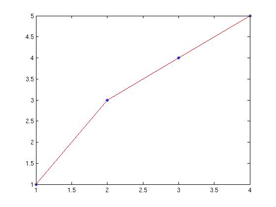
Data = [1 3 4 5];
plot(Data, 'r-');
hold on;
plot(Data, 'b*');
Yields

Attaway shows at end of 2.5.2 a little 9-line script that
creates an x-range, plots sin(x) and cos(x) on same axes,
and illustrates the use of legend and title
commands. Check it out for yourselves.
Saving a Plot as a File
You will be featuring plots in your project writeups as a major
tool in helping yourself and your readers understand ('visualize')
your
results.
- Make sure you have informative title, legend, x and y axis
labels.
- Make sure your axis and data ranges show the phenomena
you want to illustrate.
- Pick colors, line styles, and plot symbols
that maximally clarify your results.
In the resulting Figure window with your gorgeous plot,
- Go to File
- Go to Save As...
- Type a descriptive name into the File Name box, no suffix.
- Go to Files of Type drop-down and pick a type. I like JPEG
image (*.jpg) -- pretty universal, but sometimes has compression
artifacts; *.png is a compressionless alternative.
When you pick a type the proper suffix appears on your file name
- Klik on Save
- New file appears in your working directory. Use it in your word
processor to create final .PDF file for handing in.
Some Real-Life Situations
-
Suppose I generate answers y(x) for x = [1 10 100 1000 10000]
and want to plot y against x, but don't want 10000-long vectors
99.95% full of zeros?
-
How do I put two or more graphs on same axes in one plot?
-
How do I generate more than one plot at once? Add legends? Colors?
This page shows
about 2% of Matlab's plotting power but it's all we really need.
Plot Demos
% Set up some data
xdata = zeros(1,10);
ydata = zeros(1,10);
for elt= 1:10
    xdata(elt) = elt;
    ydata(elt) = elt*elt;
end

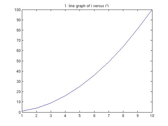
plot(ydata); % defaults to plot(ydata, 'b-')
title('1. line graph of i versus i*i');

figure;  % create a new plot window...
         %we'll wind up with 10 of em
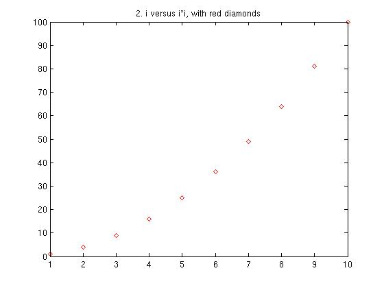
plot(ydata, 'rd');
title('2. i versus i*i, with red diamonds');

figure;
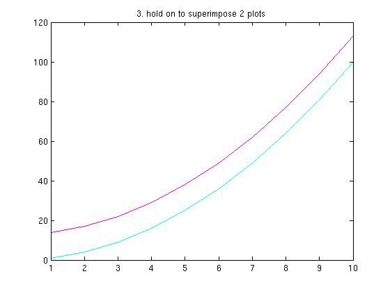
plot(ydata, 'c');  % cyan
hold on;
plot(ydata+13, 'm'); % magenta
title('3. hold on to superimpose 2 plots');
hold off  % else the rest will be superimposed

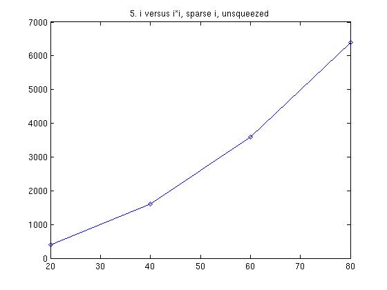
Spaced-out equally-spaced X data points:
xdata = [20 40 60 80];
ydata = zeros(1,4);
yindex = 1;
for n = 1:4
    ydata(n) = xdata(n) * xdata(n);
end

figure
plot(ydata, '-*');  % plot line and *
title('4. x versus x*x for sparse x, squeezed');

figure
plot(xdata,ydata,'-d'); % due to autoscale
                        % and equally-spaced X
                        % values, graph looks same
title('5. n versus n*n, sparse n, unsqueezed');


Spaced-out UNequally-spaced X data points:
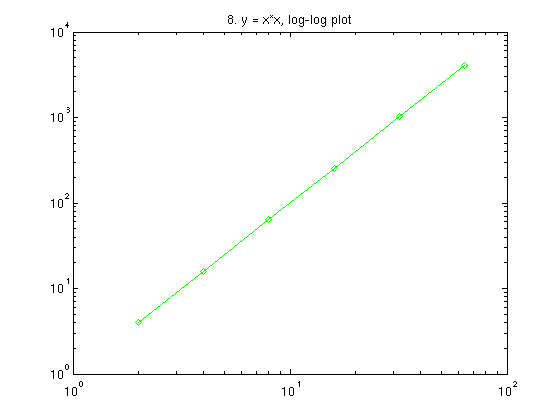
Plotting power functions
like x = y2, Volume =
1/Pressure.
The log-log plot.
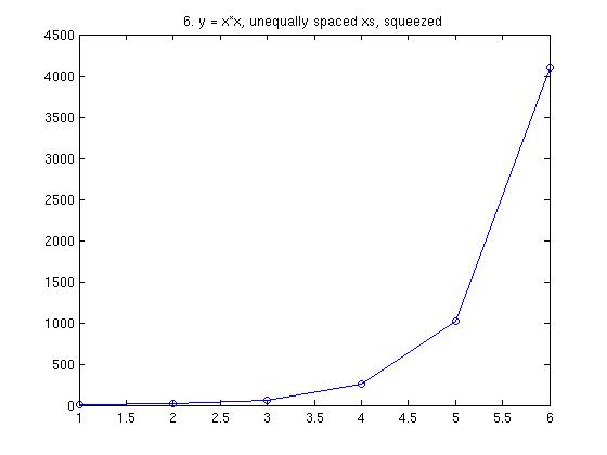
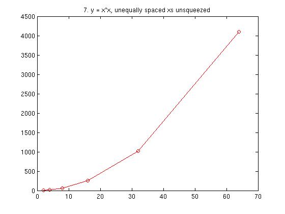
xdata = [2 4 8 16 32 64 ];
ydata = zeros(1,6);
for n = 1:length(xdata)
    ydata(n) = xdata(n) ^ 2;  % power law
end

figure
plot(ydata, '-o');  % plot with line and circle,
title('6. y = x*x, unequally spaced xs, squeezed');

figure
plot(xdata,ydata,'r-o'); % now graphs different
title('7. y = x*x, unequally spaced xs unsqueezed');


figure
% log-log plot for power relationship
% yields straight line no matter how x values spaced
loglog(xdata, ydata,'g-d');
title('8. y = x*x, log-log plot');

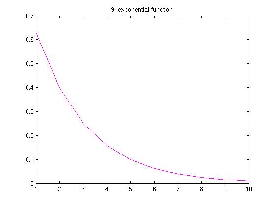
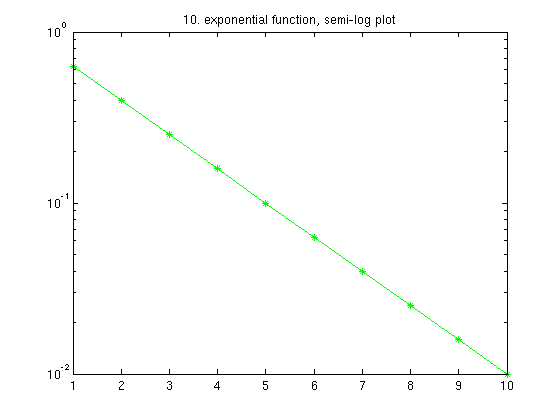
Plotting Exponential relationships like
y =ex, DecayingVal = InitVal(-.1*t)
The semi-log plot.
xdata = linspace(1,10,10);
ydata = zeros(1,10);
for n = 1:10
  ydata(n) = 100 ^ (-.1 * xdata(n));  % exponential
end;

figure;
plot(xdata, ydata, 'm-');
title('9. exponential function');

figure;
semilogy(xdata, ydata, 'g-*');  % semi-log plot
title('10. exponential function, semi-log plot');

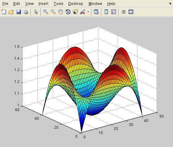
Fun with Surface Plots
Making 2-D plots using surf can be neat.
It can get complicated, but there are some defaults that can be used
to generate some pretty cool graphics without a lot of trouble.
For example.
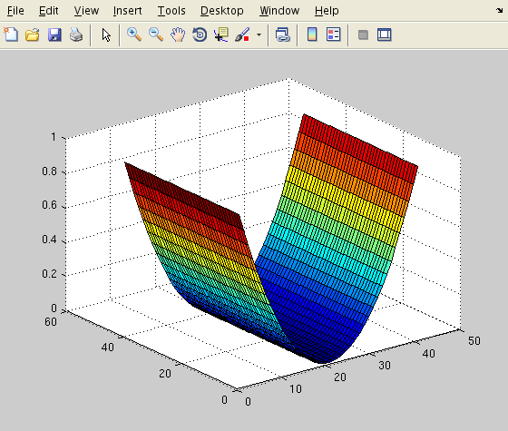
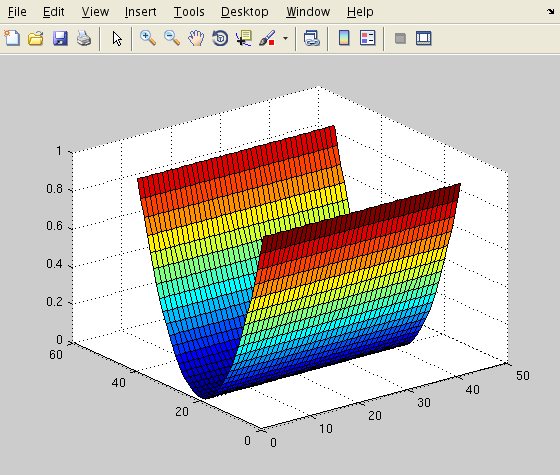
a = -1 : .05 : 1;       % a 41 element vector from -1 to 1
b = a .* a;             % a^2 pointwise
c = linspace(1, 1, 41); % a 41 element vector of 1s
x2 = c' * b;            % array representing z(x,y) = x^2
y2 = b' * c;            % array representing z(x,y) = y^2
view(3);                % default 3-D view
figure
surf(x2);  % plot the x2 array as a surface
figure
surf(y2);  % plot the y2 array as a surface
Produces the following figure windows (note the toolbar!).
These were produced by a window-grab, not by "Save As..."
(Note: The window produced by surf may need
to be closed before another surface plot can be made)


We can add x^2 and y^2 to get a paraboloid (illustrating the squared
Euclidean distance function / 2),
x2_y2 = (x2 + y2) / 2;   % z(x,y) = (x^2 + y^2) / 2
figure
surf(x2_y2);
or take the outer product of a^2 with itself to get a
particular 4th order function
x2y2 = 1 - b' * b;       % z(x,y) = 1 - x^2 * y^2
figure
surf(x2y2);
Which produces


For even more fun we can combine the last two,
z4 = x2y2 + x2_y2;
figure
surf(z4);
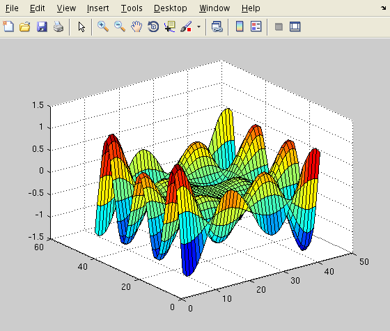
or make our own function using for loops.
z = zeros(41,41);
for m = 1:41
  for n = 1:41
    y = (m - 21) / 20;
    x = (n - 21) / 20;
    z(m,n) = (x*x + y*y) * ...
      sin(1.7*pi*x) * cos(2.7*pi*y);
  end
end
figure
surf(z);


Last update: 04/20/2011: RN
